Selected Work
A curated selection of talks, articles, and conversations on data storytelling, communication, and the shifting role of the analyst.
From my years at storytelling with data
During my six years on Cole Nussbaumer Knaflic's storytelling with data team, I authored articles and contributed to videos teaching the principles of effective data communication to a global audience.
VIDEOS
ARTICLES

What clutter can we eliminate? Every chart has things on it that aren't earning their place. This piece walks through a real business example to show what changes when you strip a visual down to what actually matters — and how much more your audience sees when you do. Read article

What your audience really wants
A before-and-after that makes the point better than any principle could. The original chart isn't wrong — it just isn't doing what the audience actually needs. Worth reading if you've ever felt like your analysis was solid but the presentation didn't land. Read more
What I’m thinking about now

Connecting the title and data
A small change that punches above its weight. Most slide titles describe what the chart shows ("Q3 Revenue by Region"). The better move is to tell your audience what they should take away from it. This piece shows the difference.
Read article
LinkedIn: Recent thoughts
The role of the analyst is shifting. AI can produce analysis, draft reports, and build slides faster than any of us can — but it can't judge what matters in a business, read a room, or know which decision is on the line. That gap is where the next generation of analysts will earn their keep, and where most of my recent musings live.
Podcast: Deacs.AI conversation (July 2025)
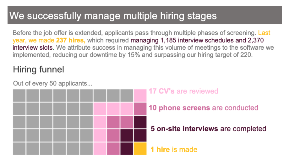
What is a square area chart?
A square area graph can be an great choice when you want to visualize and compare numbers of very different magnitudes. This example shows how to visualize a hiring funnel using this graph type. Read article